- Home
- Services
-
DIGITAL MARKETING
 Search Engine Optimization
  Social Media Optimization
- Guest Posting Service
 Brand Reputation Management
 - Apps Marketing
- Facebook Advertising
 PPC Management
  SEO Migration & Consultancy
  Local Business Listing
WEB DEVELOPMENT
- Core PHP Web Development
- E-Commerce Web Development
 Open Source Development
  Content Management System
 - Database Development
 Website Maintenance
 Website Migration
WEB DESIGN
- Custom Website Design
- E-Commerce Web Design
- Flash Designing
- Facebook Page Design
 Re-Designing
  Logo Designing & Branding
 - PSD to HTML Development
Application Development
 Web Application Development
 - iPhone App Development
- Android App Development
- Window App Development
- Facebook App Development
Other Services
 Content Writing Service
  Hire Dedicated Resource
-
- Packages
- About Us
- Contact Us


Responsive & Mobile-First Design
We engineer mobile-first web architectures that prioritize performance, accessibility, and user retention. By treating the mobile experience as the primary foundation rather than an afterthought, we ensure your platform is built for how the modern web is actually consumed.
15+
Years Experience500+
Projects Delivered30+
Countries Served99%
Client RetentionRequest a Project Quote
Get a customized technical architecture plan from our experts.
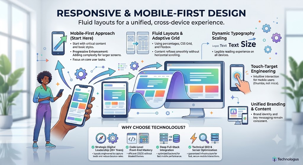
Responsive & Mobile-First Design: Engineering Fluid Experiences
Most people today discover your business on their phones first. If your website feels clunky, slow, or hard to use on mobile, you’re losing customers before they even get a chance to know you.
At Technologus, we don’t just make websites “work” on mobile — we design truly responsive, mobile-first experiences that feel natural and fast on every device. From the smallest smartphone to large desktop monitors, your website should adapt beautifully, load quickly, and deliver a consistent, delightful experience.
We build fluid layouts that flex intelligently, prioritize performance, and put real user behavior at the center of every decision.
What We Offer

Mobile-First Responsive Design
We start every project with the mobile experience in mind — not as an afterthought.
This approach ensures your website is fast, focused, and optimized for the majority of your users who browse on phones. We design clean interfaces that scale up gracefully to tablets and desktops, creating a unified experience across all screen sizes.
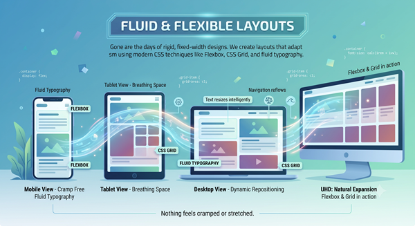
Fluid & Flexible Layouts
Gone are the days of rigid, fixed-width designs. We create layouts that adapt smoothly using modern CSS techniques like Flexbox, CSS Grid, and fluid typography.
Your content breathes naturally on any screen. Images, text, navigation, and calls-to-action resize and reposition intelligently so nothing feels cramped or stretched.
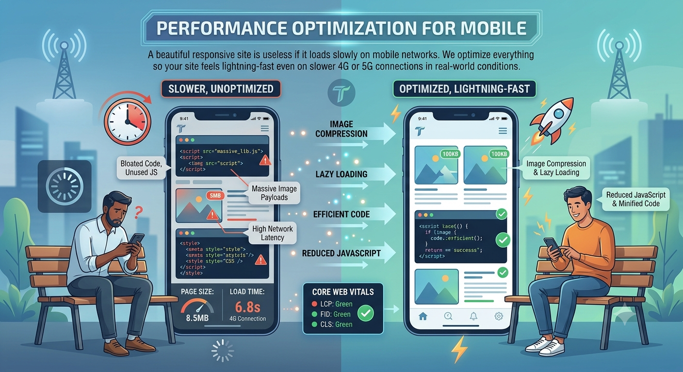
Performance Optimization for Mobile
A beautiful responsive site is useless if it loads slowly on mobile networks.
We optimize everything — image compression, lazy loading, efficient code, reduced JavaScript, and Core Web Vitals — so your site feels lightning-fast even on slower 4G or 5G connections in real-world conditions.
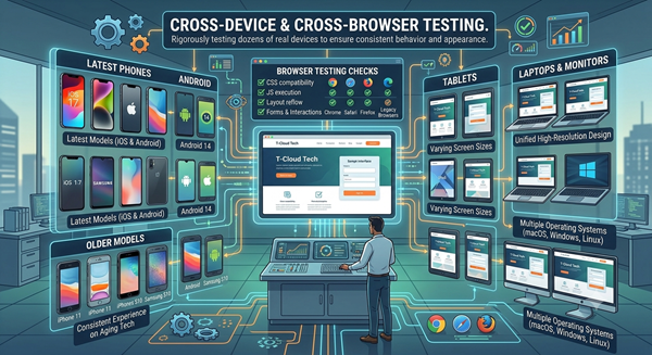
Cross-Device & Cross-Browser Testing
We rigorously test your website across dozens of real devices and browsers to ensure consistent behavior and appearance.
From the latest iPhones and Android devices to older phones, tablets, laptops, and large monitors — your audience gets the same high-quality experience no matter what they use.
Our Process
We follow a structured yet flexible approach:
User & Device Research –
Understanding your audience’s devices, behavior, and pain points.
Mobile-First Wireframing –
Designing for small screens first, then scaling up.
Fluid Layout Development –
Building with modern, adaptable code.
Rigorous Testing –
Real-device testing across multiple breakpoints.
Continuous Optimization –
Post-launch monitoring and improvements based on real user data.
Why Choose Technologus
Choosing the right partner for responsive and mobile-first design means turning fragmented, device-specific experiences into a unified, seamless journey across every screen — not just making your site “look good” on phones, but ensuring it performs, converts, and delivers for real users. We don’t just build fluid layouts; we craft intelligent, performance-optimized experiences that load fast, adapt effortlessly, and keep visitors engaged — all grounded in user behavior, real-world testing, and data-driven decisions.
True Mobile-First Philosophy, Not Just Responsive Checkboxes
Many agencies claim to be “mobile-friendly” but still design for desktop first and then squeeze everything into mobile. We genuinely start with mobile — smaller screens, touch interactions, slower networks, and distracted users. This discipline results in cleaner designs, faster load times, and better overall user experiences.
2. Deep Expertise in Fluid & Modern CSS Techniques
We don’t rely on clunky frameworks or outdated methods. Our team masters CSS Grid, Flexbox, container queries, fluid typography, and custom properties to create truly adaptable, future-proof layouts that look elegant on every device — today and years from now.
Performance-Obsessed Approach
We treat speed as a core design principle. Every project goes through strict performance audits. We optimize images, fonts, scripts, and rendering so your mobile users don’t just “get by” — they enjoy a smooth, delightful experience that actually converts.
Real-World Testing & Data-Driven Decisions
We don’t stop at “it looks good on my laptop.” We test on real devices used by your target audience, analyze real user behavior through analytics and heatmaps, and continuously refine the experience based on actual data — not assumptions.
Frequently Asked Questions
Responsive design makes a website adapt to different screen sizes. Mobile-first starts by designing for the smallest screens first, then progressively enhances the experience for larger devices. We follow the mobile-first approach because it usually leads to cleaner code, faster performance, and better user experiences.
Yes. Google uses mobile-first indexing, meaning it primarily looks at your mobile version when ranking pages. A fast, well-structured responsive site significantly improves your chances of ranking higher in search results.
It depends on the complexity of your current website. Most mid-sized projects take between 6 to 10 weeks. We break the work into clear phases so you can see progress and provide feedback throughout.
We test on both. While simulators help during development, we always validate the experience on real physical devices (iPhones, Android phones, tablets, and different desktop monitors) before launch.
Absolutely. Many clients start with a Mobile Performance Audit. We can often deliver significant speed and usability improvements through targeted optimizations without changing the entire design.
Not at all. Mobile-first simply means we build the core, essential experience for smaller screens first, and then progressively enhance the design with more complex layouts, animations, and multi-column structures for larger desktop environments.
We use progressive disclosure and intelligent UI patterns. Instead of squishing a 10-column table, we utilize collapsible card layouts or allow users to swipe through columns, ensuring the data remains legible and interactive without overwhelming the viewport.
It will likely improve them. Google utilizes mobile-first indexing, meaning it ranks your site based on its mobile version. By modernizing your architecture and improving Core Web Vitals, we actively protect and enhance your technical SEO footprint.
Ready to Engineer Your Next Digital Asset?
Partner with an agency that understands complex business logic, robust database architecture, and uncompromised security. Let's build a software solution tailored exclusively for your operations.
Request a Technical Consultation



















Technologus
- B - 31, Sector - 6 NOIDA (INDIA)
- +91-9873469643 / 9212742139
- sales@technologus.com